The GridBagLayout: Unterschied zwischen den Versionen
(Die Seite wurde neu angelegt: „=The GridBagLayout= The GridBagLayout is the most powerful and for beginners the most complicated layout manager out of the Java AWT package. It is used to lay ou…“) |
K |
||
| (11 dazwischenliegende Versionen von 2 Benutzern werden nicht angezeigt) | |||
| Zeile 1: | Zeile 1: | ||
| + | [[Datei:de.png|18px]] [[GridBagLayout|Deutsche Version]] | ||
| + | |||
=The GridBagLayout= | =The GridBagLayout= | ||
| − | The GridBagLayout is the most powerful and for beginners the most complicated layout manager | + | The GridBagLayout is the most powerful and for beginners the most complicated layout manager coming with the Java AWT package. It is used to lay out the graphical user interfaces of Java applications into a grid. |
| − | <br>This layout manager hardly lets unfulfilled | + | <br>This layout manager hardly lets unfulfilled anything we might wish for the arrangement of components in a user interface. |
==A first simple example== | ==A first simple example== | ||
| − | The following Java code shows a | + | The following Java code shows a simple example and is used as a starting point for other sections. |
| − | < | + | <syntaxhighlight lang="java"> |
import java.awt.*; | import java.awt.*; | ||
import static java.awt.GridBagConstraints.*; | import static java.awt.GridBagConstraints.*; | ||
| Zeile 95: | Zeile 97: | ||
} | } | ||
} | } | ||
| − | </ | + | </syntaxhighlight> |
| − | [[Bild: | + | [[Bild:Figure1.JPG]] |
As you can see, by default everything is centered. | As you can see, by default everything is centered. | ||
| Zeile 103: | Zeile 105: | ||
==GridBagConstraints - the conditions for the arrangement in the layout== | ==GridBagConstraints - the conditions for the arrangement in the layout== | ||
In the above example, an object of the class "GridBagConstraints" was used. What GridBagConstraints are and for what they are used is explained below. | In the above example, an object of the class "GridBagConstraints" was used. What GridBagConstraints are and for what they are used is explained below. | ||
| − | |||
GridBagConstraints are variables to determine the dimension and the orientation of GUI elements in a GridBagLayout. | GridBagConstraints are variables to determine the dimension and the orientation of GUI elements in a GridBagLayout. | ||
It is recommended for each new component to create also a new GridBagConstraints object, and not to pass the constraints with the method GridBagLayout.setConstraints, but with the proposed parameters of the method Container.add: | It is recommended for each new component to create also a new GridBagConstraints object, and not to pass the constraints with the method GridBagLayout.setConstraints, but with the proposed parameters of the method Container.add: | ||
| − | < | + | <syntaxhighlight lang="java"> |
GridBagConstraints constraints = new GridBagConstraints(); | GridBagConstraints constraints = new GridBagConstraints(); | ||
... | ... | ||
add(component, constraints); | add(component, constraints); | ||
| − | </ | + | </syntaxhighlight> |
GridBagLayout is very different from GridLayout, despite the similar name. Unlike GridLayout, the components can vary in size and a component can span multiple rows and columns. Rows can also be highly variable in height and columns can have different widths, according to the desired size of the components housed there (PreferredSize, or MinimumSize if the PreferredSize is too large, MaximumSize does not matter). A component can also be smaller than its display area. With display area we mean the surface of the associated cell[s] of a component. | GridBagLayout is very different from GridLayout, despite the similar name. Unlike GridLayout, the components can vary in size and a component can span multiple rows and columns. Rows can also be highly variable in height and columns can have different widths, according to the desired size of the components housed there (PreferredSize, or MinimumSize if the PreferredSize is too large, MaximumSize does not matter). A component can also be smaller than its display area. With display area we mean the surface of the associated cell[s] of a component. | ||
| − | Particular caution should be exercised when the PreferredSize of a component has no fixed value and can be changed | + | Particular caution should be exercised when the PreferredSize of a component has no fixed value and can be changed with user input, such as in a JTextField. It may then be better to give the PreferredSize a fixed value, thereby preventing that the layout moves unintentionally. |
| − | To plan the layout, it is recommended to take a sheet of paper and to draw first a suitable grid on which we draw the components. Then we can easily define their constraints. | + | To plan the layout, it is recommended to take a sheet of paper and to draw first a suitable grid on which we draw the components. Then we can more easily define their constraints. |
===gridx, gridy=== | ===gridx, gridy=== | ||
| − | These are "int" values, representing the coordinates of the upper-left cell of a component in the grid, where gridx determines the column and gridy the row. The default value RELATIVE means that this component is placed next to / below the previously added component ( | + | These are "int" values, representing the coordinates of the upper-left cell of a component in the grid, where gridx determines the column and gridy the row. The default value RELATIVE means that this component is placed next to / below the previously added component (this is usually not recommended, but the more complicated example given at the end of this tutorial shows a variant using relative coordinates). |
| − | To arrange | + | To arrange five single-cellular components into three columns and three rows in a cross-shaped arrangement, we can use, for example, the following coordinates: |
| − | < | + | <syntaxhighlight lang="java"> |
addGB(new JButton("North"), gridx = 2, gridy = 1); | addGB(new JButton("North"), gridx = 2, gridy = 1); | ||
addGB(new JButton("West"), gridx = 1, gridy = 2); | addGB(new JButton("West"), gridx = 1, gridy = 2); | ||
| Zeile 130: | Zeile 131: | ||
addGB(new JButton("East"), gridx = 3, gridy = 2); | addGB(new JButton("East"), gridx = 3, gridy = 2); | ||
addGB(new JButton("South"), gridx = 2, gridy = 3); | addGB(new JButton("South"), gridx = 2, gridy = 3); | ||
| − | </ | + | </syntaxhighlight> |
| − | Although the coordinates actually start at 0, for clarity | + | Although the coordinates actually start at 0, for the clarity of this example, row 0 and column 0 are not used. In this case we simply write gridx=1 for the first column and gridy=1 for the first row. |
| − | Figure 1 [[Bild: | + | Figure 1 [[Bild:Figure1.JPG]] |
===gridwidth, gridheight=== | ===gridwidth, gridheight=== | ||
| − | Specifies the number of cells in a row / column for the component. The default value is 1. We use REMAINDER to specify that the component spans from gridx / gridy to the last cell in the row / column. | + | Specifies the number of cells in a row / column for the component. The default value is 1. We use REMAINDER to specify that the component spans from gridx / gridy to the last cell in the row / column. When we work with relative coordinates, we can mark the last component of each row with gridwidth = REMAINDER (see the more complex example at the bottom of this page). |
In the above example, to give the northern component three horizontal cells, beginning with the first column, we can use the following constraints: | In the above example, to give the northern component three horizontal cells, beginning with the first column, we can use the following constraints: | ||
| − | < | + | <syntaxhighlight lang="java"> |
| − | addGB(new JButton("North, | + | addGB(new JButton("North, spans three columns"), gridx = 1, gridy = 1, gridwidth = 3); |
| − | </ | + | </syntaxhighlight> |
| − | Figure 2[[Bild: | + | Figure 2[[Bild:Figure2.JPG]] |
Or instead, we may want to assign three vertical cells to the western component. In which case we can specify the following constraints: | Or instead, we may want to assign three vertical cells to the western component. In which case we can specify the following constraints: | ||
| − | < | + | <syntaxhighlight lang="java"> |
addGB(new JButton("<html>West<br>now<br>spans<br>three rows<br>"), gridx = 1, gridy = 1, gridwidth = 1, gridheight = 3); | addGB(new JButton("<html>West<br>now<br>spans<br>three rows<br>"), gridx = 1, gridy = 1, gridwidth = 1, gridheight = 3); | ||
| − | </ | + | </syntaxhighlight> |
| − | Figure 3[[Bild: | + | Figure 3[[Bild:Figure3.JPG]] |
We can also assign several horizontal and several vertical cells to a component, as here, the West with two columns and two rows: | We can also assign several horizontal and several vertical cells to a component, as here, the West with two columns and two rows: | ||
| − | < | + | <syntaxhighlight lang="java"> |
addGB(new JButton("North"), gridx = 3, gridy = 1); | addGB(new JButton("North"), gridx = 3, gridy = 1); | ||
addGB(new JButton("<html>West West<br>West West"), gridx = 1, gridy = 1, gridwidth = 2, gridheight = 2); | addGB(new JButton("<html>West West<br>West West"), gridx = 1, gridy = 1, gridwidth = 2, gridheight = 2); | ||
| Zeile 161: | Zeile 162: | ||
addGB(new JButton("East East"), gridx = 2, gridy = 3, gridwidth = 2); | addGB(new JButton("East East"), gridx = 2, gridy = 3, gridwidth = 2); | ||
addGB(new JButton("South"), gridx = 1, gridy = 3); | addGB(new JButton("South"), gridx = 1, gridy = 3); | ||
| − | </ | + | </syntaxhighlight> |
| − | Figure 3a[[Bild: | + | Figure 3a[[Bild:Figure3a.JPG]] |
===fill=== | ===fill=== | ||
| Zeile 172: | Zeile 173: | ||
* VERTICAL: make the component tall enough to fill its display area vertically | * VERTICAL: make the component tall enough to fill its display area vertically | ||
* BOTH: the component should fill the entire display area | * BOTH: the component should fill the entire display area | ||
| − | The default is NONE, that is no scaling. | + | The default is NONE, that is no scaling is performed. |
The northern component from the above example can be scaled horizontally with the following constraints: | The northern component from the above example can be scaled horizontally with the following constraints: | ||
| − | < | + | <syntaxhighlight lang="java"> |
addGB(new JButton("North"), gridx = 1, gridy = 1, gridwidth = 3, gridheight = 1, fill = HORIZONTAL); | addGB(new JButton("North"), gridx = 1, gridy = 1, gridwidth = 3, gridheight = 1, fill = HORIZONTAL); | ||
| − | </ | + | </syntaxhighlight> |
(see Figure 4) | (see Figure 4) | ||
| − | + | As we can also see in the sample code, the following import statement can be used to import the static constants in order to not always have to specify explicitly the class of the constant (ie you can write for example HORIZONTAL rather than GridBagConstraints.HORIZONTAL): | |
| − | < | + | <syntaxhighlight lang="java"> |
import static java.awt.GridBagConstraints.*; | import static java.awt.GridBagConstraints.*; | ||
| − | </ | + | </syntaxhighlight> |
===weightx, weighty=== | ===weightx, weighty=== | ||
| Zeile 192: | Zeile 193: | ||
The default value for both fields is 0, which means that the column / row never gets additional space. | The default value for both fields is 0, which means that the column / row never gets additional space. | ||
| − | It | + | It's enough to specify the weight for a single component of a column / row. The layout manager sets the weight of the column / row equal to the maximum weight of all components in this column / row. |
If multi-cellular components are used, the extra space will tend to go towards the far right column and the bottom row. | If multi-cellular components are used, the extra space will tend to go towards the far right column and the bottom row. | ||
| Zeile 199: | Zeile 200: | ||
If we want the second column in the above example to get any additional horizontal space, we can program this with weightx in the following way: | If we want the second column in the above example to get any additional horizontal space, we can program this with weightx in the following way: | ||
| − | < | + | <syntaxhighlight lang="java"> |
addGB(new JButton("Center"), gridx = 2, gridy = 2, weightx = 1.0, weighty = 0.0); | addGB(new JButton("Center"), gridx = 2, gridy = 2, weightx = 1.0, weighty = 0.0); | ||
| − | </ | + | </syntaxhighlight> |
| − | Figure 4[[Bild: | + | Figure 4[[Bild:Figure4.JPG]] |
====weighty: vertical distribution of extra space==== | ====weighty: vertical distribution of extra space==== | ||
With weighty we can, for example, assign any additional vertical space to the second row by inserting "Center" with weighty = 1.0: | With weighty we can, for example, assign any additional vertical space to the second row by inserting "Center" with weighty = 1.0: | ||
| − | < | + | <syntaxhighlight lang="java"> |
addGB(new JButton("Center"), gridx = 2, gridy = 2, weightx = 0.0, weighty = 1.0); | addGB(new JButton("Center"), gridx = 2, gridy = 2, weightx = 0.0, weighty = 1.0); | ||
| − | </ | + | </syntaxhighlight> |
| − | Figure 5[[Bild: | + | Figure 5[[Bild:Figure5.JPG]] |
| − | + | Here we can also see clearly that the weight from the center now includes the entire row. This is so because the layout manager sets the weight of the row (or column) equal to the maximum weight of all components in the row (or column). | |
====weightx, weighty: combining space distributions==== | ====weightx, weighty: combining space distributions==== | ||
We can of course also combine weightx=1.0 and weighty=1.0: | We can of course also combine weightx=1.0 and weighty=1.0: | ||
| − | < | + | <syntaxhighlight lang="java"> |
addGB(new JButton("Center"), gridx = 2, gridy = 2, weightx = 1.0, weighty = 1.0); | addGB(new JButton("Center"), gridx = 2, gridy = 2, weightx = 1.0, weighty = 1.0); | ||
| − | </ | + | </syntaxhighlight> |
| − | Figure 6[[Bild: | + | Figure 6[[Bild:Figure6.JPG]] |
====weightx, weighty: the values of the weights==== | ====weightx, weighty: the values of the weights==== | ||
| − | In general, the weights 0.0 and 1.0 are given as the extremes: the numbers in between can be used as necessary. Higher values indicate that the row or column should get more space. However, what counts is not the absolute value but the relation of values to each other. In the following example, the second column gets twice as much as the first | + | In general, the weights 0.0 and 1.0 are given as the extremes: the numbers in between can be used as necessary. Higher values indicate that the row or column should get more space. However, what counts is not the absolute value but the relation of values to each other. |
| − | < | + | |
| + | In the following example, the extra horizontal space is distributed in such a way, that the second column gets exactly twice as much as the first column: | ||
| + | <syntaxhighlight lang="java"> | ||
addGB(new JButton("West"), gridx = 1, gridy = 2, weightx = 0.5, weighty = 0.0); | addGB(new JButton("West"), gridx = 1, gridy = 2, weightx = 0.5, weighty = 0.0); | ||
addGB(new JButton("Center"), gridx = 2, gridy = 2, weightx = 1.0, weighty = 0.0); | addGB(new JButton("Center"), gridx = 2, gridy = 2, weightx = 1.0, weighty = 0.0); | ||
| − | </ | + | </syntaxhighlight> |
| − | Figure 7[[Bild: | + | Figure 7[[Bild:Figure7.JPG]] |
| − | We can see that the first column has received 20 pixels (10 pixels to the left and right of "West") additional horizontal space and the second column twice as much, namely 40 pixels (20 pixels to the left and right of "Center"). | + | We can see that the first column has received 20 pixels (10 pixels to the left and right of "West") of the additional horizontal space and the second column twice as much, namely 40 pixels (20 pixels to the left and right of "Center"). |
| − | ====weightx, weighty: | + | ====weightx, weighty: space distribution with multi-cellular components==== |
| − | If we modify the example of Figure 2 so that the "North" is inserted with weightx=1.0, then this column weight also applies to the east, while the west and center do not get | + | If we modify the example of Figure 2 so that the "North" is inserted with weightx=1.0, then this column weight also applies to the east, while the west and center do not get additional space. This is so because the northern component spans three columns. In this case the extra space will tend to go towards the far right column (respectively to the bottom row in the case of a multi-row component): |
| − | < | + | <syntaxhighlight lang="java"> |
addGB(new JButton("North, now spans three columns"), gridx = 1, gridy = 1, gridwidth = 3, gridheight = 1, | addGB(new JButton("North, now spans three columns"), gridx = 1, gridy = 1, gridwidth = 3, gridheight = 1, | ||
fill = NONE, weightx = 1.0, weighty = 0.0, | fill = NONE, weightx = 1.0, weighty = 0.0, | ||
anchor = CENTER, insets = new Insets(0, 0, 0, 0), ipadx = 0, ipady = 0);//default values | anchor = CENTER, insets = new Insets(0, 0, 0, 0), ipadx = 0, ipady = 0);//default values | ||
| − | </ | + | </syntaxhighlight> |
| − | Figure 7a [[Bild: | + | Figure 7a [[Bild:Figure7a.JPG]] |
===anchor=== | ===anchor=== | ||
| Zeile 254: | Zeile 257: | ||
The baseline-related values are: BASELINE, BASELINE_LEADING, BASELINE_TRAILING, ABOVE_BASELINE, ABOVE_BASELINE_LEADING, ABOVE_BASELINE_TRAILING, BELOW_BASELINE, BELOW_BASELINE_LEADING and BELOW_BASELINE_TRAILING. | The baseline-related values are: BASELINE, BASELINE_LEADING, BASELINE_TRAILING, ABOVE_BASELINE, ABOVE_BASELINE_LEADING, ABOVE_BASELINE_TRAILING, BELOW_BASELINE, BELOW_BASELINE_LEADING and BELOW_BASELINE_TRAILING. | ||
| − | The default value is CENTER. The use of the orientation-related values | + | The default value is CENTER. The use of the '''orientation-related''' values is recommended (in addition to CENTER): |
| − | < | + | <syntaxhighlight lang="java"> |
------------------------------------------------- | ------------------------------------------------- | ||
|FIRST_LINE_START PAGE_START FIRST_LINE_END| | |FIRST_LINE_START PAGE_START FIRST_LINE_END| | ||
| Zeile 265: | Zeile 268: | ||
|LAST_LINE_START PAGE_END LAST_LINE_END| | |LAST_LINE_START PAGE_END LAST_LINE_END| | ||
------------------------------------------------- | ------------------------------------------------- | ||
| − | </ | + | </syntaxhighlight> |
If we want to modify the example of Figure 6 so that the "Center" is at the top left in its cell, we can program it this way: | If we want to modify the example of Figure 6 so that the "Center" is at the top left in its cell, we can program it this way: | ||
| − | < | + | <syntaxhighlight lang="java"> |
addGB(new JButton("Center"), gridx = 2, gridy = 2, weightx = 1.0, weighty = 1.0, anchor = FIRST_LINE_START); | addGB(new JButton("Center"), gridx = 2, gridy = 2, weightx = 1.0, weighty = 1.0, anchor = FIRST_LINE_START); | ||
| − | </ | + | </syntaxhighlight> |
| − | Figure 8[[Bild: | + | Figure 8[[Bild:Figure8.JPG]] |
===insets=== | ===insets=== | ||
| Zeile 281: | Zeile 284: | ||
If we want to modify the example of Figure 8 in such a way to create a distance of 10 pixels at the top and left of "Center", we can program it this way: | If we want to modify the example of Figure 8 in such a way to create a distance of 10 pixels at the top and left of "Center", we can program it this way: | ||
| − | < | + | <syntaxhighlight lang="java"> |
addGB(new JButton("Center"), gridx = 2, gridy = 2, weightx = 1.0, weighty = 1.0, | addGB(new JButton("Center"), gridx = 2, gridy = 2, weightx = 1.0, weighty = 1.0, | ||
anchor = FIRST_LINE_START, insets = new Insets(10, 10, 0, 0)); | anchor = FIRST_LINE_START, insets = new Insets(10, 10, 0, 0)); | ||
| − | </ | + | </syntaxhighlight> |
| − | Figure 9[[Bild: | + | Figure 9[[Bild:Figure9.JPG]] |
===ipadx, ipady=== | ===ipadx, ipady=== | ||
| Zeile 294: | Zeile 297: | ||
If we want to modify the example of Figure 6 so that the "Center" is enlarged in width and in height by 20 pixels, we can program it this way: | If we want to modify the example of Figure 6 so that the "Center" is enlarged in width and in height by 20 pixels, we can program it this way: | ||
| − | < | + | <syntaxhighlight lang="java"> |
addGB(new JButton("Center"), gridx = 2, gridy = 2, weightx = 1.0, weighty = 1.0, ipadx = 20, ipady = 20); | addGB(new JButton("Center"), gridx = 2, gridy = 2, weightx = 1.0, weighty = 1.0, ipadx = 20, ipady = 20); | ||
| − | </ | + | </syntaxhighlight> |
| − | Figure 10[[Bild: | + | Figure 10[[Bild:Figure10.JPG]] |
| + | |||
| + | ==A more complex example== | ||
| + | |||
| + | The following Java code should serve as a leading example: | ||
| + | |||
| + | [[GridBagLayout_Example]] | ||
| + | |||
| + | |||
| − | [[Kategorie: | + | [[Kategorie:LayoutManager]] |
[[Kategorie:Java API]] | [[Kategorie:Java API]] | ||
[[Kategorie:Tutorials (Java)]] | [[Kategorie:Tutorials (Java)]] | ||
Aktuelle Version vom 9. Juli 2018, 12:02 Uhr
Inhaltsverzeichnis
The GridBagLayout
The GridBagLayout is the most powerful and for beginners the most complicated layout manager coming with the Java AWT package. It is used to lay out the graphical user interfaces of Java applications into a grid.
This layout manager hardly lets unfulfilled anything we might wish for the arrangement of components in a user interface.
A first simple example
The following Java code shows a simple example and is used as a starting point for other sections.
import java.awt.*;
import static java.awt.GridBagConstraints.*;
import javax.swing.*;

public class GridBagLayoutExample extends JPanel {

    // all constraint fields (for clarity only):
    private int gridx, gridy, gridwidth, gridheight, fill, anchor, ipadx, ipady;
    private double weightx, weighty;
    private Insets insets;

    public GridBagLayoutExample() {
        setLayout(new GridBagLayout());
        example();
    }

    /*
     Although the coordinates actually start at 0, for clarity
     in this example, row 0 and column 0 are not used.
     In this case we simply write gridx=1 for the first column
     and gridy=1 for the first row.
     */
    private void example() {
        addGB(new JButton("North"), gridx = 2, gridy = 1);
        addGB(new JButton("West"), gridx = 1, gridy = 2);
        addGB(new JButton("Center"), gridx = 2, gridy = 2);
        addGB(new JButton("East"), gridx = 3, gridy = 2);
        addGB(new JButton("South"), gridx = 2, gridy = 3);
    }

    //Convenience methods for adding components with the required GridBagConstraints:
    private void addGB(Component component, int gridx, int gridy) {
        addGB(component, gridx, gridy, 1, 1, NONE, 0.0, 0.0, CENTER, new Insets(0, 0, 0, 0), 0, 0);
    }
    private void addGB(Component component, int gridx, int gridy, int gridwidth) {
        addGB(component, gridx, gridy, gridwidth, 1, NONE, 0.0, 0.0, CENTER, new Insets(0, 0, 0, 0), 0, 0);
    }
    private void addGB(Component component, int gridx, int gridy, int gridwidth, int gridheight) {
        addGB(component, gridx, gridy, gridwidth, gridheight, NONE, 0.0, 0.0, CENTER, new Insets(0, 0, 0, 0), 0, 0);
    }
    private void addGB(Component component, int gridx, int gridy, int gridwidth, int gridheight, int fill) {
        addGB(component, gridx, gridy, gridwidth, gridheight, fill, 0.0, 0.0, CENTER, new Insets(0, 0, 0, 0), 0, 0);
    }
    private void addGB(Component component, int gridx, int gridy, double weightx, double weighty) {
        addGB(component, gridx, gridy, 1, 1, NONE, weightx, weighty, CENTER, new Insets(0, 0, 0, 0), 0, 0);
    }
    private void addGB(Component component, int gridx, int gridy, double weightx, double weighty, int ipadx, int ipady) {
        addGB(component, gridx, gridy, 1, 1, NONE, weightx, weighty, CENTER, new Insets(0, 0, 0, 0), ipadx, ipady);
    }
    private void addGB(Component component, int gridx, int gridy, double weightx, double weighty, int anchor) {
        addGB(component, gridx, gridy, 1, 1, NONE, weightx, weighty, anchor, new Insets(0, 0, 0, 0), 0, 0);
    }
    private void addGB(Component component, int gridx, int gridy, double weightx, double weighty, int anchor, Insets insets) {
        addGB(component, gridx, gridy, 1, 1, NONE, weightx, weighty, anchor, insets, 0, 0);
    }

    private void addGB(Component component, int gridx, int gridy, int gridwidth, int gridheight,
            int fill, double weightx, double weighty, int anchor, Insets insets,
            int ipadx, int ipady) {
        GridBagConstraints constraints = new GridBagConstraints();
        constraints.gridx = gridx;
        constraints.gridy = gridy;
        constraints.gridwidth = gridwidth;
        constraints.gridheight = gridheight;
        constraints.fill = fill;
        constraints.weightx = weightx;
        constraints.weighty = weighty;
        constraints.anchor = anchor;
        constraints.insets = insets;
        constraints.ipadx = ipadx;
        constraints.ipady = ipady;
        add(component, constraints);
    }

    public static void main(String[] args) {
        SwingUtilities.invokeLater(new Runnable() {

            @Override
            public void run() {
                JFrame frame = new JFrame("GridBagLayout Example");
                frame.setDefaultCloseOperation(JFrame.EXIT_ON_CLOSE);
                frame.setSize(300, 200);
                frame.setLocationRelativeTo(null);
                frame.setContentPane(new GridBagLayoutExample());
                frame.setVisible(true);
            }
        });
    }
}
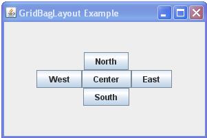
As you can see, by default everything is centered.
GridBagConstraints - the conditions for the arrangement in the layout
In the above example, an object of the class "GridBagConstraints" was used. What GridBagConstraints are and for what they are used is explained below. GridBagConstraints are variables to determine the dimension and the orientation of GUI elements in a GridBagLayout.
It is recommended for each new component to create also a new GridBagConstraints object, and not to pass the constraints with the method GridBagLayout.setConstraints, but with the proposed parameters of the method Container.add:
GridBagConstraints constraints = new GridBagConstraints();
...
add(component, constraints);
GridBagLayout is very different from GridLayout, despite the similar name. Unlike GridLayout, the components can vary in size and a component can span multiple rows and columns. Rows can also be highly variable in height and columns can have different widths, according to the desired size of the components housed there (PreferredSize, or MinimumSize if the PreferredSize is too large, MaximumSize does not matter). A component can also be smaller than its display area. With display area we mean the surface of the associated cell[s] of a component.
Particular caution should be exercised when the PreferredSize of a component has no fixed value and can be changed with user input, such as in a JTextField. It may then be better to give the PreferredSize a fixed value, thereby preventing that the layout moves unintentionally.
To plan the layout, it is recommended to take a sheet of paper and to draw first a suitable grid on which we draw the components. Then we can more easily define their constraints.
gridx, gridy
These are "int" values, representing the coordinates of the upper-left cell of a component in the grid, where gridx determines the column and gridy the row. The default value RELATIVE means that this component is placed next to / below the previously added component (this is usually not recommended, but the more complicated example given at the end of this tutorial shows a variant using relative coordinates). To arrange five single-cellular components into three columns and three rows in a cross-shaped arrangement, we can use, for example, the following coordinates:
addGB(new JButton("North"), gridx = 2, gridy = 1);
addGB(new JButton("West"), gridx = 1, gridy = 2);
addGB(new JButton("Center"), gridx = 2, gridy = 2);
addGB(new JButton("East"), gridx = 3, gridy = 2);
addGB(new JButton("South"), gridx = 2, gridy = 3);
Although the coordinates actually start at 0, for the clarity of this example, row 0 and column 0 are not used. In this case we simply write gridx=1 for the first column and gridy=1 for the first row.
gridwidth, gridheight
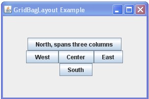
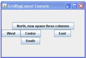
Specifies the number of cells in a row / column for the component. The default value is 1. We use REMAINDER to specify that the component spans from gridx / gridy to the last cell in the row / column. When we work with relative coordinates, we can mark the last component of each row with gridwidth = REMAINDER (see the more complex example at the bottom of this page). In the above example, to give the northern component three horizontal cells, beginning with the first column, we can use the following constraints:
addGB(new JButton("North, spans three columns"), gridx = 1, gridy = 1, gridwidth = 3);
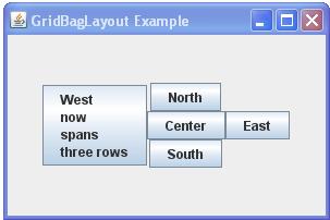
Or instead, we may want to assign three vertical cells to the western component. In which case we can specify the following constraints:
addGB(new JButton("<html>West<br>now<br>spans<br>three rows<br>"), gridx = 1, gridy = 1, gridwidth = 1, gridheight = 3);
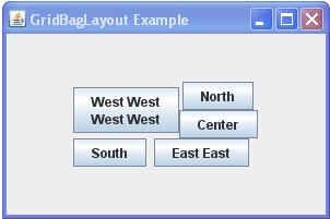
We can also assign several horizontal and several vertical cells to a component, as here, the West with two columns and two rows:
addGB(new JButton("North"), gridx = 3, gridy = 1);
addGB(new JButton("<html>West West<br>West West"), gridx = 1, gridy = 1, gridwidth = 2, gridheight = 2);
addGB(new JButton("Center"), gridx = 3, gridy = 2);
addGB(new JButton("East East"), gridx = 2, gridy = 3, gridwidth = 2);
addGB(new JButton("South"), gridx = 1, gridy = 3);
fill
If the display area of a component is larger than the desired size of the component (PreferredSize / MinimumSize), we can scale the component horizontally, vertically or in both directions. The following values are valid for the "fill" property:
   * NONE: do not scale the component
   * HORIZONTAL: make the component wide enough to fill its display area horizontally
   * VERTICAL: make the component tall enough to fill its display area vertically
   * BOTH: the component should fill the entire display area
The default is NONE, that is no scaling is performed.
The northern component from the above example can be scaled horizontally with the following constraints:
addGB(new JButton("North"), gridx = 1, gridy = 1, gridwidth = 3, gridheight = 1, fill = HORIZONTAL);
(see Figure 4)
As we can also see in the sample code, the following import statement can be used to import the static constants in order to not always have to specify explicitly the class of the constant (ie you can write for example HORIZONTAL rather than GridBagConstraints.HORIZONTAL):
import static java.awt.GridBagConstraints.*;
weightx, weighty
If we want the components not to remain concentrated in the center of the panel, but spread over the area available, we must tell the layout manager how the additional space should be distributed. This is done with weightx for distributing the horizontal space and weighty for distributing the vertical space. The extra space is distributed to each column / row in relation to the weight.
The default value for both fields is 0, which means that the column / row never gets additional space.
It's enough to specify the weight for a single component of a column / row. The layout manager sets the weight of the column / row equal to the maximum weight of all components in this column / row.
If multi-cellular components are used, the extra space will tend to go towards the far right column and the bottom row.
weightx: horizontal distribution of extra space
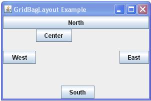
If we want the second column in the above example to get any additional horizontal space, we can program this with weightx in the following way:
addGB(new JButton("Center"), gridx = 2, gridy = 2, weightx = 1.0, weighty = 0.0);
weighty: vertical distribution of extra space
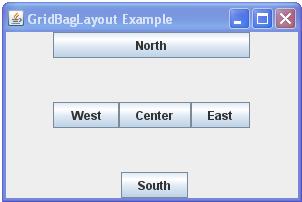
With weighty we can, for example, assign any additional vertical space to the second row by inserting "Center" with weighty = 1.0:
addGB(new JButton("Center"), gridx = 2, gridy = 2, weightx = 0.0, weighty = 1.0);
Here we can also see clearly that the weight from the center now includes the entire row. This is so because the layout manager sets the weight of the row (or column) equal to the maximum weight of all components in the row (or column).
weightx, weighty: combining space distributions
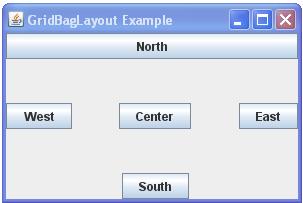
We can of course also combine weightx=1.0 and weighty=1.0:
addGB(new JButton("Center"), gridx = 2, gridy = 2, weightx = 1.0, weighty = 1.0);
weightx, weighty: the values of the weights
In general, the weights 0.0 and 1.0 are given as the extremes: the numbers in between can be used as necessary. Higher values indicate that the row or column should get more space. However, what counts is not the absolute value but the relation of values to each other.
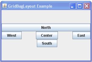
In the following example, the extra horizontal space is distributed in such a way, that the second column gets exactly twice as much as the first column:
addGB(new JButton("West"), gridx = 1, gridy = 2, weightx = 0.5, weighty = 0.0);
addGB(new JButton("Center"), gridx = 2, gridy = 2, weightx = 1.0, weighty = 0.0);
We can see that the first column has received 20 pixels (10 pixels to the left and right of "West") of the additional horizontal space and the second column twice as much, namely 40 pixels (20 pixels to the left and right of "Center").
weightx, weighty: space distribution with multi-cellular components
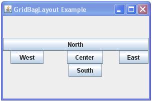
If we modify the example of Figure 2 so that the "North" is inserted with weightx=1.0, then this column weight also applies to the east, while the west and center do not get additional space. This is so because the northern component spans three columns. In this case the extra space will tend to go towards the far right column (respectively to the bottom row in the case of a multi-row component):
addGB(new JButton("North, now spans three columns"), gridx = 1, gridy = 1, gridwidth = 3, gridheight = 1,
        fill = NONE, weightx = 1.0, weighty = 0.0,
        anchor = CENTER, insets = new Insets(0, 0, 0, 0), ipadx = 0, ipady = 0);//default values
anchor
This field is used when the component is smaller than its display area. We use it to determine where the component is placed within its display area. By default it is centered.
There are three types of possible values: orientation-related, baseline-related and absolute values. Orientation-related values refer to the component orientation of the container (since JDK 1.4), baseline-related values refer to the baseline of the component (since JDK 1.6).
The absolute values are: CENTER, NORTH, NORTHEAST, EAST, SOUTHEAST, SOUTH, SOUTHWEST, WEST and NORTHWEST.
The orientation-related values are: PAGE_START, PAGE_END, LINE_START, LINE_END, FIRST_LINE_START, FIRST_LINE_END, LAST_LINE_START and LAST_LINE_END.
The baseline-related values are: BASELINE, BASELINE_LEADING, BASELINE_TRAILING, ABOVE_BASELINE, ABOVE_BASELINE_LEADING, ABOVE_BASELINE_TRAILING, BELOW_BASELINE, BELOW_BASELINE_LEADING and BELOW_BASELINE_TRAILING.
The default value is CENTER. The use of the orientation-related values is recommended (in addition to CENTER):
-------------------------------------------------
|FIRST_LINE_START   PAGE_START     FIRST_LINE_END|
|                                                |
|                                                |
|LINE_START           CENTER             LINE_END|
|                                                |
|                                                |
|LAST_LINE_START     PAGE_END       LAST_LINE_END|
-------------------------------------------------
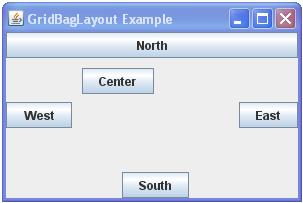
If we want to modify the example of Figure 6 so that the "Center" is at the top left in its cell, we can program it this way:
addGB(new JButton("Center"), gridx = 2, gridy = 2, weightx = 1.0, weighty = 1.0, anchor = FIRST_LINE_START);
insets
This field specifies the external padding of the component, that is the minimum distance between the component and the four edges of its display area.
The default value is: new Insets(0, 0, 0, 0), which means that the component has no external padding.
If we want to modify the example of Figure 8 in such a way to create a distance of 10 pixels at the top and left of "Center", we can program it this way:
addGB(new JButton("Center"), gridx = 2, gridy = 2, weightx = 1.0, weighty = 1.0,
    anchor = FIRST_LINE_START, insets = new Insets(10, 10, 0, 0));
ipadx, ipady
These fields specify the internal padding of the component, that is the space that is added to the component, so that it becomes bigger. The width of the component is padded with ipadx and its height with ipady.
The default value for both fields is 0, which means that the component has no internal padding.
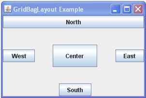
If we want to modify the example of Figure 6 so that the "Center" is enlarged in width and in height by 20 pixels, we can program it this way:
addGB(new JButton("Center"), gridx = 2, gridy = 2, weightx = 1.0, weighty = 1.0, ipadx = 20, ipady = 20);
A more complex example
The following Java code should serve as a leading example:
